Mastering Day 26: What, Why & How
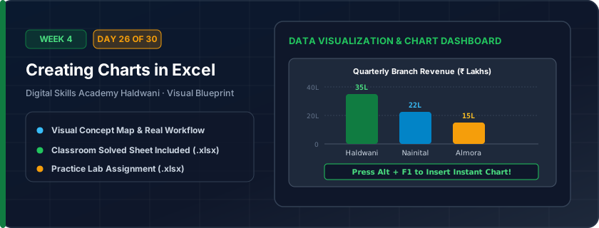
Visual graphical storytelling: Column & Bar charts (comparing categories), Line charts (showing trends over time), and Pie charts (displaying proportional share of 100%).
Executives and clients don't read raw numbers; they read visual stories. A chart makes sales growth, seasonal spikes, and revenue dips visible in a single glance.
"Line charts show trends over time; Column charts compare items; Pie charts show parts of 100%. Press Alt + F1 for an instant chart!"
What You Will Master Today
- Choosing the right chart type: Column/Bar for comparisons, Line for trends over time, Pie for proportions of 100%
- Chart elements: Chart Title, Axis Titles, Data Labels, Gridlines, Legend
- Formatting chart design: Theme colors, removing chart clutter, highlighting peak data point
- Moving, resizing, and printing charts cleanly
Step-by-Step Practical Walkthrough
Select your data range including row headers and column headers.
Go to Insert tab > Charts > Clustered Column Chart (or press Alt + F1).
Click on the Chart Title and give it a descriptive name.
Click the '+' button at the top-right of the chart to toggle Data Labels or Axis Titles.
Haldwani Retail Chains - Quarterly Sales Comparison Bar Chart
Study the completed reference worksheet below. Every column illustrates the standard formatting, formula structure, and alignment applied by professional office operators.
| Store Location | Q1 Sales (₹) | Q2 Sales (₹) | Q3 Sales (₹) | Total Sales (₹) |
|---|---|---|---|---|
| Nainital Road Main | 1450000 | 1620000 | 1850000 | 4920000 |
| Kaladhungi Road Branch | 1120000 | 1280000 | 1350000 | 3750000 |
| Mukhani Chauraha | 1780000 | 1950000 | 2100000 | 5830000 |
| Bareilly Road Hub | 950000 | 1080000 | 1150000 | 3180000 |
Monthly Household / Business Budget Distribution Pie Chart
- Task 1: Select range A4:B9 and insert a 2D Clustered Column Chart using Alt + F1.
- Task 2: Change the Chart Title to 'Monthly Operational Budget Breakdown'.
- Task 3: Select range A4:B9 again and insert a 2D Pie Chart to visualize percentage share.
- Task 4: Add Data Callouts to display percentage values directly on pie slices.
Exercise Data Template Preview: Download the .xlsx file below and execute each task independently.
| Budget Expense Head | Monthly Allocation (₹) | Percentage Share % |
|---|---|---|
| Office Rent & Maintenance | 25000 | 35.7% |
| Employee Salaries | 32000 | 45.7% |
| Electricity & Power Backup | 6500 | 9.3% |
| High-Speed Internet & Software | 3500 | 5.0% |
| Stationery & Tea Refreshment | 3000 | 4.3% |
Never use 3D charts in corporate office reports! 3D skewing distorts visual proportions and makes it hard for managers to compare heights accurately.
Need 1-on-1 Guidance on Day 26?
Join our hands-on classroom lab sessions at Digital Skills Academy in Haldwani. Every student receives a dedicated PC workstation, live instructor reviews, and interview prep.